jack hainsworth
Art and Design Blog

Activist.
The Brief.
6 Nov 2018
For the third section of this semester, Activism, our main project was to create a single issue political party in groups of 5 or 6, and create artwork such as banners, protest signs, and posters, to go along with it.
I palyed with a few ideas, including focusing on environmental issues, and American politics. However, I was worried that being as we were going to be put into groups, that these ideas and views would be hard to group together with someone elses in the class. I thought about doing something satirical, like a few others I had heard in the class. For example, a plan to make the politions rich and corrupt, portrayed through a good light.
In the end, after some more thought, I decided that a fairly safe bet would be to make my party revolve around the ideas of free speech and censorship, an idea which I had first thought to be generally agreeable as a good thing.
Once everyone had decided on an idea, we were paired up with all the other people in the class who had a similar interest, for example, the 70% of the class who focused on women's rights. Mine and a few others were fairly hard to place, and so we were put into one group together. We all thought this was going to be a little difficult, as almost no one in this group had the same idea. Luckily, in the next session, we were told that it would be better if everyone continued to work individually on their idea, and expand on it further.

My Manifesto.
6 Nov 2018
We then were told to write a manifesto, a collection of the policies and goals for our politcal party, as well as a name for our party. As my idea was free speech, and the ability to speak openly about whatever issues you have, I went for 'The Open Party'. I knew that one of hte points in my manifesto would be to be able to say anything you want, as long as it is not a direct call to violence, but I wanted a few more to go with it. So in the end, my first draft of my manifesto was:
1.No language which does not incite violence shall be prohibited.
2.No one shall be discriminated against for their speech or thought, unless it disagrees with point 1.
Mini Lectures.
6 Nov 2018
Our first mini lecture focused on the Anthropocene, and the idea that human's are the main cause of global warming.
ANTHROPOCENE:
Earth's most recent geologic time period as being human-influenced, or anthropogenic, based on overwhelming global evidence that atmospheric, geologic, hydrologic, biospheric and other earth system processes are now altered by humans.
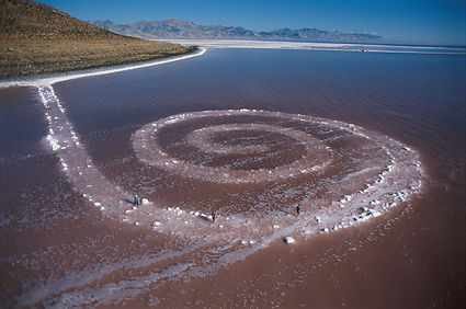
There was an art movement in the 60's called Land art, in which people used nature to create artwork that worked with it, instead of against it.
"Robert Smithson’s Spiral Jetty, located at Rozel Point on the northeastern shore of Great Salt Lake in Utah, is one of the most remarkable examples of Land art. In 1970, assisted by a crew operating dump trucks, a tractor, and a front loader, Smithson displaced some 6,000 tons of black basalt rock and earth from the adjacent shore to form a coil 1,500 feet long and approximately 15 feet wide, winding counterclockwise into the lake. Created at a time when water levels were particularly low, Spiral Jetty was submerged in 1972. Droughts caused the lake to recede in 2002, and the sculpture has remained visible ever since."
Our second lecture was around the Black Lives Matter movement. The first slide gives 3 rules of engagement when looking at this lecture: 1. Check my Privelige, 2. No assumptions, and 3. Be open to correction. Contrary to the beliefs of a few of my fellow classmates, I don't feel that my being white or male has priveliged me at all, but instead that if anything, being ginger, gay, and having aspergers, has had quite the opposite effect.
This lecture focussed mainly on the problems currently going on in America, where Black people have been repeatly shot by police officers for seemingly no good reason. It also stated that America was built on slavery.
It then talks about Sondra Perry, a black artist who focusses her work mostly around the problems black people have faced. Her most famous work is called Typhon Coming On, showing conditions inside the slave ships.
Our third mini lecture was around the feminist movement, starting in the 1900's with first wave feminists, up to modern day third wave feminism.
A point that was brought up was whether male artists are as 'good' as people give them credit, because of quotes made by them. The example given is a quote from Pablo Picasso.
"Every time I change wives I should burn the last one. That way I'd be rid of them. They wouldn't be around to complicate my existence. Maybe, that would bring back my youth, too. You kill the woman and you wipe out the past she represents."
During an earlier part of our project, we visited a gallery space in digbeth, and there was a poster with a similar narrative.
This is an idea that I disagree with wholly. We don't look up to artists, or anyone for that matter, for every single one of their views, or things that they have said. People such as Picasso, Einstein or Darwin are looked up to for their actions, their intelligence, their achievements, not a view they may have had which collelated with the views of their era.
Our fourth and final lecture was on Anti-Capitalism, and the alternatives to it people have attempted over the years. The main focus of this talk was Communism, and the works of Karl Marx.
"Karl Marx (5 May 1818 – 14 March 1883) was a German philosopher, economist, historian, sociologist, political theorist, journalist and socialist revolutionary"

Idea Development.
6 Nov 2018
After discussing my idea with the other members of my group, they said that the manifesto came off fairly strongly, and a little too agressively. I realised that this was due to the tone and wording of it, and so re wrote it using different language, which I agreed worked better.
1.No language should be prohibited unless it is a call to violence.
2.No person should have the right to censor on the basis of a person's speech.
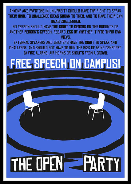
I also came up with some ideas for posters to create to go along side the manifesto, with taglines such as "Rise to the TOP for free speech", TOP being the initials of The Open Party.
Once I had this manifesto and a few rough ideas on paper, I went to photoshop and started designing. My end results after the first day was such:

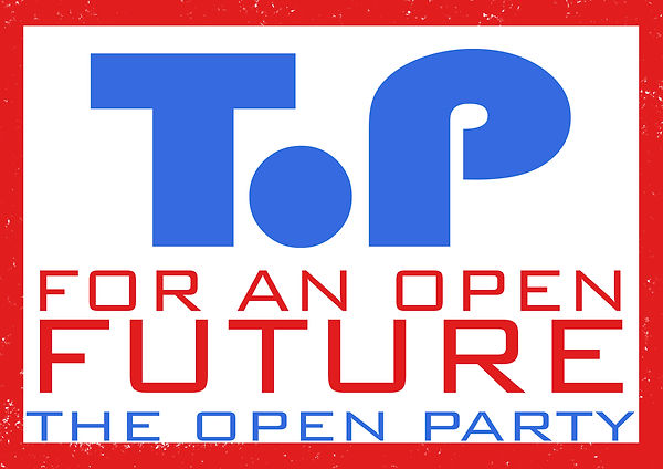
I tried 2 ideas for the logo, with an open O and a filled in one. I preferred the filled in one, but after feedback from the tutor, I decided that neither designs really reflected my polices, or the posters themselves. The way they were borded of and closes in, felt very claustrophic and hyperbolic to the name The Open Party. Another complaint was that the colour blue had been used, which has a "negative connotation in politics as being conservative, and right wing". And so, during the next session I redesigned the posters, this being the result:
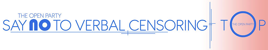
I preferred this design much more, especially the new font I found online, and the minimilism of it. The new logo also worked much better, howver a complaint was that it looked too much like a railway sign.
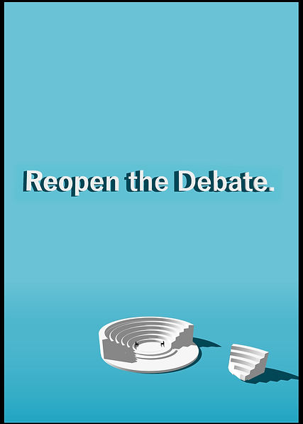
After a talk with another tutor, I looked into the idea of open debate, instead of just general free speech, as this would be too open of a topic to create a single issue party around. I agreed with this idea, and looked into ways I could lnk this into my poster design. I also wanted to include my 3d modelling from the previous section, as this was one of the stronger parts of it. A suggestion from the tutor was to look into greek 'Agora's, circular theatres used for debates in anchient greek. They had a very nice design, which would not only be simple enough to model, but would also work well with my current aesthetic, with the steps and theatre being a circular shape.
Digging Deeper.
6 Nov 2018
Using a website called 'It's Nice That', as a suggestion from my tutor, I looked into more poster designs, of what other people were doing similar to my idea. It was difficult to find relevant designs, amd most were intended for music concerts, movies or magazines, and didn't look formal enough to be a political poster. I tried to find some dirrerent ones, looking up political banners, but all I could find were actual ones used by American Politicians such as George Bush and Ted Cruise, which would be cheesy and unoriginal if I copied.
More Development.
6 Nov 2018


Google sketchup was a good choice to make these models, as you are easily able to change the textures and edge style, to look realstic, minimalistic, or stylised to look hand drawn.
Getting these designs to work in a poster form was fairly difficult, but I liked the idea of using the hand drawn style from sketchup and working with it, and so I decided to try a torn paper style, similar to what I had seen on posters and banners on YouTube.
Final Posters.
6 Nov 2018
After suggestion to look more into posters on It's Nice That, I came across a few that I liked as actual posters rather than adverts like the others I had previously found. I came across one which seemed to be a collage, with a high constrast, black and white on a bold blue background. I desided to try this design for my poster, and as there was a section for text at the top, I added an updated version of my manifesto in that space. The black on white text at the top, while working on the original inspiration, didn't really work on this design I was making, and so I made the entire background blue instead of the bottom half, and the text seemed to work much better with the rest of the design. I ended up being really happy with this design.
As the first design included alot of text, I decided to make another poster to go along with it, with much less text. This would make the design alot more powerful, but would also have a less obvious purspoe without the context of the first design.
I like the minimalistic design of the second poster, and the high contrast of the white agora against the blue background. The text was done in the same program as the agora model, to keep a consistency throughout the poster. When I showed this design to the group, the one main complaint was that the black border made the design feel claustrophobic, and so I cut this off before putting the poster up with everyone else's, and it looked alot better.
My main problem with my first poster design, apart from the amount of small text, is that it reminds me too much of 50's era communism posters, an oversite I didn't notice until I had finished the design and printed it out.