jack hainsworth
Art and Design Blog

Collage.
24 Sep 2018
Our first lesson of the year, was based around the medium of collage. We were asked to bring in any old instruction manuals we had, or print some off from the internet. At the start of the day, we had a small powerpoint showing some artist who use collage as their main medium, and how they use it effectively. For the practical half of the day, we were given a list of various techniques, including tearing off a section of the image, layering different images, folding an image to look different, and making one image out of others. We had to cut up our manuals, and combine them with the spare manuals we also had access to, to make a small collage for each of these techniques.
I liked the collage I ended up making, involving drawing on one image to turn it into something else. I started with a bookshelf from an Ikea manual, and added figures and ladders to make it look like a building, and a construction site, changing the scale of the image. Another one I liked was recreating a cement pourer from a different manual, out of parts from the Ikea one. An Ikea manual was perfect for this type of collage, as the images are very minimalistic, and are able to be manipulated easily.
Collage isn't a medium I use very often, and am not a bit fan of. I liked the way some of these turned out, but not as finished art pieces. I don't think it's the sort of thing I would choose in future projects.


High Brow/Low Brow.
27 Sep 2018
Our second session focussed around the concept of High Brow versus Low Brew, and why it shouldn't be a consideration to us when choosing our subjects. After our Library Inductions, we were asked to bring in an example of a piece of art we liked, one we didn't, one we had used in a previous project, and one which links to one of the 5 artist lenses. I chose a piece by M.C.Escher for the piece we had previously used. I chose a piece from a book of a collection of photos of Clocks and Watches, as this was the book which first caught my eye. For the piece I didn't like, I chose a piece of Contemporary Art, one which did not require alot of skill to create, with the majority of the piece's value coming from the meaning given to it afterwords, as this is the type of art I dislike the most.
After our lecture, we came together as a group to select a piece of art from someone, and pin it to the wall. We then selected another, and decided as a group whether we thought it was more high brow, or low brow than the previous, in a manner similar to Play Your Cards Right. We repeated this around 20 times, to create a wave formation on the wall. The trend seemed to be that the older the piece was, and the more famous it was, then the more high brow it was - pieces from artists such as Van Gogh and Da Vinci. The exception to this was Picasso, who seemed to be judged as more low brow, most likely due to it's abstract style. The pattern here seemed to be that the more realistic the piece, the more complex and physical skill oriented the piece, the more high brow it was.


Bookbinding.
27 Sep 2018
In this session, we learned a simple way to create books, using our collage from the first session along with paper as filler. We had 2 styles of japanese bookbinding to choose from, simple or complex. Since I already had some experience in bookbinding, I decided to go for the more challenging option.
At first, the instructions seemed very complicated, and trying to push the needle through the 16 layers of paper was very annoying. But after a few stitched, the instructions started to make sense, and it started to come together very smoothly. I ended up with about half of my length of thread unused, as the instructions were probably for a full size book, being much thicker than mine.
I liekd the result, and will probably consider using this method again for any books I make. I think that coptic binding, which I have tried before, creates a better looking book with proper front and back covers, however japanese bidning is much faster and uses alot less materials.


Historian Launch/BMAG.
1 Oct 2018
For the start of our main historian project, we visited the Birgmingham Museum and Art Gallery. We first had a lecture by one of the people who work there, talking about how they document and archive pieces and exhibits when they are not on display in the museum. We then had the chance to look at a range of items from the egyptian and roman era, most notably an egyptian burial mask. We were then given an exercise to write down what we thought of 2-3 pieces, how it made us feel, any connoations, what is it made of, what is it's history, etc. I chose to focus on the burial mask,and the section of a roman mosiac.
![IMG_4637[1].JPG](https://static.wixstatic.com/media/cc5da3_835e755146d84e4493dc190f8d82b386~mv2_d_3024_4032_s_4_2.jpg/v1/fill/w_600,h_800,al_c,q_85,usm_0.66_1.00_0.01,enc_avif,quality_auto/IMG_4637%5B1%5D_JPG.jpg)
After we finished this exercise, we were allowed to go into the rest of the museum, and look at any exhibits that interested us. I liked alot of the scultures, as well as this series of images.I liked it becaue it's very minalistic, and it's the sort of thing I could see on the walls of my living room, wrapping around the outside of the room.


BMAG Collage.
4 Oct 2018
We used the photos we took of the exhibits at the start of the week, to create new collages in the same style as the first session. As I wasn't intenting to use collage in my final project, I focussed more on idea generator for that rather than this task. I still created a few ideas as practice none the less. I like the pattern created out of the section of roman mosiac, and could be used as a background for something else.


Lapworth Museum.
8 Oct 2018
We visited the Lapworth Museum in Birmingham, and had a look around their natural history exhibits.
Some of my favorite exhibits were the walls of rocks, and the tabletop of various gemstones. I liked these because of my love for order and organisation, and how aesthetically pleasing it was. The wall was also open, allowing people to feel the difference between igneous, sedimentary and metamorphic rocks.
The wall of gemstones was a collection of the most interesitngly shapes stone the museum could find. It was different to others, as it was not organised by type or name, but by colour, to get the best looking result.
We also got a look at the back rooms, where they keep the exhibits which are either not currently on display, or are too precious or delicate to be in public view. I liked the draws of shells and bones for the same reason I liked the wall of rocks, seeing everything organised and catalogued, in an almost Tetris like fashion.


Starting the Project.
4 Oct 2018
After our visit to the BMAG, we were told what our main project would be, to create a book of at least 16 pages, based around one of the items we were shown. The most common example was the burial mask, which was also the item I chose to base mine on. This is because it was one of the most fleshed out items, with the biggest history and backstory, compared to the other smaller items.
One of the first ideas I had was to create a fictional histroy of the person who had worn the mask, and what his life was like, either as a comic book or a grek or egyptian style wall of paintings dipicting the story. Although, after I realised that we could be as ambiguous as we wanted with the starting material, I decided to base mine around the idea of museums itself, and not the single item. I decided to make it comedic, as this is when my projects have worked well in the past.
After having researched and looked into Mockumentaries with my group, I decided to do a similar thing for my project, by creating a fake gallery guide, looking at modern art in a satirical way. I put together some ideas for the fictional works of art it would base around, including a starbucks cup on a plain white stand, showing how it can be hard to tell the difference between a regular everyday object, and a work of art with purpose and meaning.
After creating this image, and trying to come up with a backstory to go along with it, I realised that I wouldn't be able to create a whole book around this idea, as it was too one note and simple. I thought about going back to my origonal idea of the more realistic backstory of the mask, but I still wanted to do somethign comedy based.

Tutorial.
4 Oct 2018
This week, we were each given a half hour slot with our tutor to discuss our book ideas, and any ways we can improve them or develop them further. I talked about my idea of a Gallery guide mockumentary, and how I wasn’t very confident about creating a fully developed idea of our it.
We looked at some artists who have done similar things in the past, including the book “We go to the Art Gallery” by Dung Beetle Books, which is a mock of a children’s educational reading book, centered around the same idea I had thought of.
We looked at some other examples of similar ideas, along with the viral youtube series "Don't hug me I'm scared", which is set out like a children's tv show, but slowly decends into madness in each episode. I decided it would be a good idea to sert out my book in the same way, having the exhibits and histroies start out fairly normal, and have them get wiered nad funnier as the book goes on.
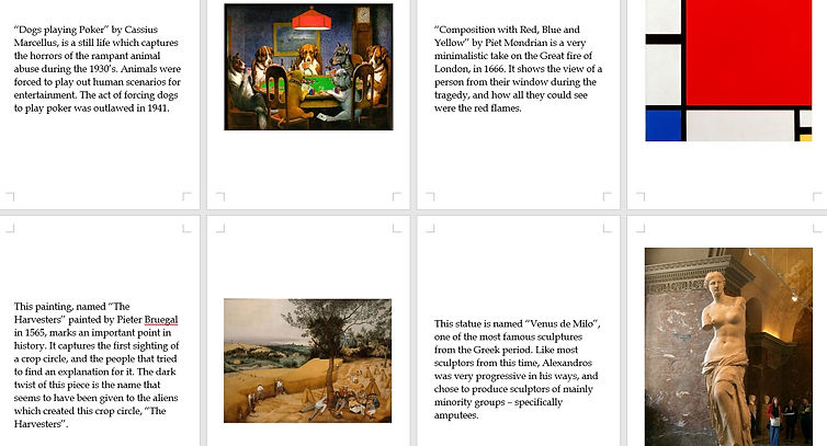
We eventually decided to change my idea to a book of misreadings of famous works of art, taking inspiration from sci-fi films which look back on modern inventions incorrectly, such as Red Dwarf or Doctor Who.


The Final Product.
4 Oct 2018
Due to problems printing the final pieces, the pages ended up alot smaller than I intended them to be, and so there is alot of white space making the book look lower quality.
The critique given by the group in this session, is that the humor works well, as long as you know the original piece of art and it's true meaning. If you are unfamiliar with the piece to begin with, the comedic misreading of it does not work as well.
If I had alot more time to make this book, I would make it a "50 top pieces of art" instead of 12, to make a thicker and more aesthetically pleasing book. I would also rank them in order of "incorrectness", so that the book starts off with fairly correct readings, and get more and more humorous and incorrect.
The cover could also have been alot better, if I had done more research into genuine educational books on this subject.