jack hainsworth
Art and Design Blog

Storyteller.
Analysing Fairytales.
7 Jan 2019
For the first session of our storyteller brief, we were split into groups of 4 or 5, and given one of six fairytales, as originally writen by the Brother's Grimm. I had The Valiant Little Soldier, a story I'd never heard of before. It was never confusing at first, with themes that appeared once at the beginning and then never again, for example the jam salesman. He seemed like he was going to be a rumble stiltskin style character.
It was hard to tell whether the main character of the tailer was the good guy or the bad guy. The story made him out to be the good guy, and ends up coming out on top, but he comes off as arrogant throughout the story.
The main themes seemed to be that you shouldn't judge a person by their background, and that you should always keep your word.
After this task, we picked a story that we wanted to focus on over this project, between "Snow White and Red Rose", "Little Red Cap", "Cinderella", Hanzel and Grettal", "The Frog Prince", and of course "The Valiant Little Tailor". As I had been analysing The Valiant Little Tailor for the most part of this session, I decided to stick with it. It was also the most interesting of them in my opinion.

First Ideas.
The first idea that I had whcih I thought could have some potential, was to write a sequal to the original story, in which the now King becomes corrupt, or makes a mistake, and regrets leaving his humble life as a Tailor. If we had more time for this project, and I had time to both write a new story and create a piece of artwork to go with it, this is the idea I would have done.
After thinking for a while, and coming up with different variations on this idea of a sequal, I decided to make the Jam Seller of the story more promiment, as this was one part of the original which I felt was a bit off, or didn't make sense.
After some suggestions by my friends to maybe include humour in my project, I came up with an idea, in which the story could be set in the real world, and modern day, and have the giants and unicorns and kings make sense. The jam would be drugs.
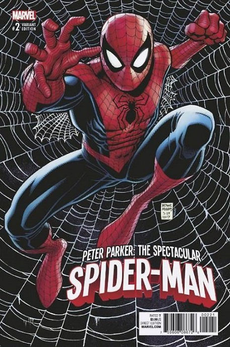
Over the holidays, I watched the movie Spiderman: Into the Spiderverse, an animated movie created in the style of a traditional comic. I had been interested in comics and comic book movies for years, and so I realised that making a comic for my project would be an effective, and more interesting format to portray the story.
Winsor and Newton.
10 Jan 2019
Kate Brinkworth came in from Winsor and Newton to give us a lecture about the types of paints and inks Winsor and Newton make, and how they can be used. She showed us one of her oil paintings, and talked about how she uses very thin layers so that the brush strokes aren't too prominent, and that she uses translucent paint to create shiny surfaces.
This is the sort of art I'm the most interested in, and it was nice to see different paints taht I hadn't heard of before, as well as the origins of the ones I already use.

Digging Deeper.
After deciding that I wanted to style my story as a comic, I looked into the most famous syles used for comics, and found certain trends. Most comics made before 2000 used a technique called Benday dots, in which an artist would use differently sized dots of one colour on top of another, in order to create the illusion of a colour half way between them, without having to use a new colour of ink. This started purely as a money saving strategy, but quickly became the most recognisable style for comic books. Most comics made after 2000 stopped using this style, as the colours available for printing were much greater, and much lower cost.

I'm going to use this more traditional style for my comic, to create a more stylised and recognisable effect.
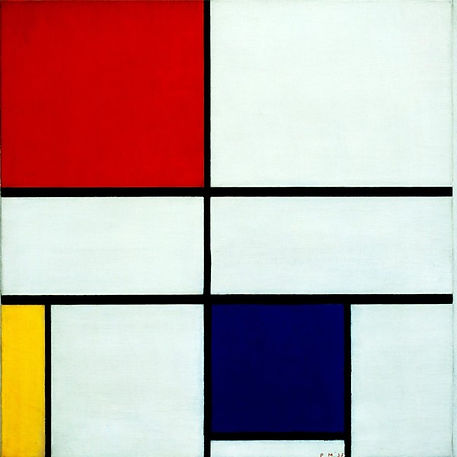
I then looked into different colouring methods and palettes, to see what I wanted to use. At first I thought about keeping it traditional, and use mroe realistic colours, but still keep them fairly bold to keep the comic style, but after some experimentation while making my first page, I found that using more abstract colours created a cool effect. This also fit with the overall story I wen't with, where the main character is on drugs for most of the comic. I chose to go with a colour scheme and art style similar to "A composition of red yellow and blue" by Piet Mondrian.
After trying to paint the first page with acrylic, I realised that it would be much easier, and look much more accurate, if I did the pages digitally. So for the rest of the pages, I used Krita, a painting program similar to Photoshop.
Final Idea.
13 Jan 2019
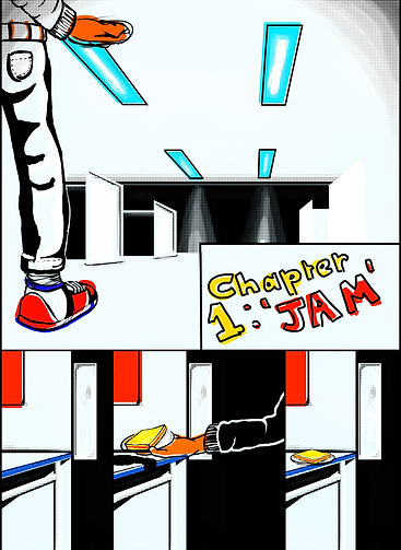
Due to the time restraints of this one week project, after making the first page and realising how long this would take to make the enitre story in comic form, I decided to just illustrate the main points of the story, him getting the jam, and 2 examples of his hallucinations.


Critique.
14 Jan 2019
In this session, we presented our final pieces to the rest of the group, and they gave their thoughts on it with no input from the person who made it. This is to check if the message and story of the piece is clear without the creator's input.
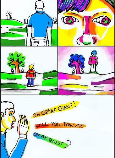
The group said that the story of my piece was pretty clear, however it wasn't as obvious that the jam was what caused the drug trip. The general consensus was that the last page made the story clear, showing the difference between realisty and what the protagonist was seeing. However, the page with the 'gaint; could have been made more clear as so what was real and what wasn't, perhaps by showing what everyone else around him was seeing.
I think that alot of these problems could have been solved if I had more time, and could make more intermediate pages, expanding on the story, amd maybe more speech.
If I had more time, I would also print it on A3 glossy magazine paper, and bind it by folding it and stapling it down the middle, like a traditional comic book. I would also add more detail to the background, to get rid of the large amount of white. This was origonally inspired by 'A composition of red, yellow and blue', but that hasn't really worked in a comic book.
